Content with HTML, CSS
Published October 26, 2021
Now that I have the barebones of a publication workflow going, it'd be nice if there was something to actually look at on this new site. I've been looking for an excused to try out TailwindCSS, a CSS framework where you compose styles through small utility classes instead of writing large ones. Let's start there.
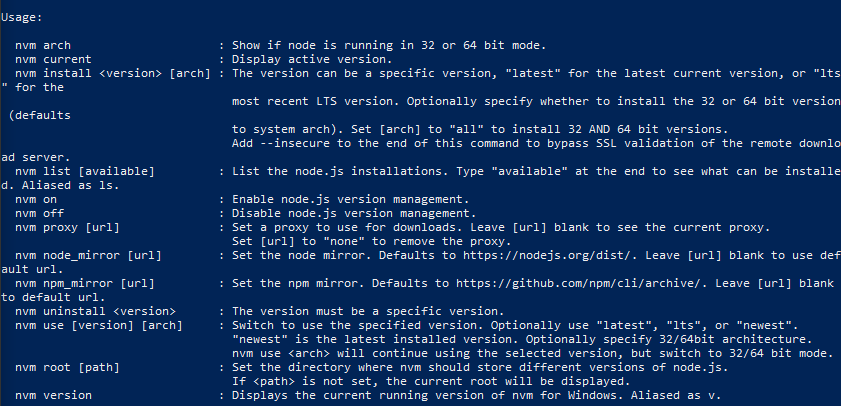
It seems like Tailwind CSS is most easily managed via npm (the Node Package Manager), which the npm resources recommend installing via a node version manager. I arbitrarily chose nvm-windows and installed it using its installer. While it didn't work via Windows Powershell immediately, after restarting powershell the nvm command worked fine.
Then, by running nvm install latest, I had node.js 16.11.1 (64-bit) installed on my machine.
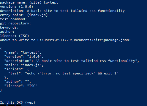
Based on some things I've read, I'll 'cd' into a new folder in powershell, and then run the npm init command to generate a basic package.json file to hold some settings related to this project. The questions that this command prompts all seem fairly straightforward, though I don't know what to include for the 'test' command yet.
Next, I'll try installing the tailwind package using the command recommended on the tailwind website:
npm install -D tailwindcss@latest postcss@latest autoprefixer@latest
Which downloads a whole bunch of packages into the node_modules folder and creates a package-lock.json file. The latter appears to track all of the included/required node modules, like an env file say. From here, following along with a pretty speedy crash course video from Traversy Media, I'll create a couple of files. First is /src/style.css, which gets three lines as specified by the tailwind documentation:
@tailwind base;@tailwind components;
@tailwind utilities;
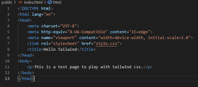
Also, empty files /src/index.html and /public/style.css, to be populated by our site html and tailwind's output css, respectively. Finally, I'll change the test script in the package.json file to "build:css": "tailwind build src/style.css -o public/style.css" and from the root folder run npm run build:css.
After about 6 seconds, the process completes, and wow is there a lot in our output style.css file now! Over 180K lines of css! Well that's intense. Presumably we'll be eliminating a lot of this as we package the site up for publication.
Over in the empty index.html file, typing ! and hitting enter gives us a very basic HTML boilerplate page, to which I'll add a reference to the (output) stylesheet and just a little bit of content to play with for now.
After installing the Live Server VS Code extension, I can right-click anywhere in this file and immediately open it in a Chrome tab for local viewing. And now we have a little playground for messing around with tailwind!
The first experiments are never pretty, but that's the point really. They're educational.
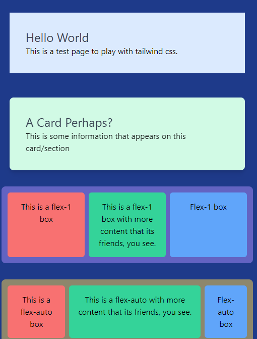
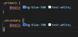
I experimented with tailwind's @apply directive, which allows for the creation of custom subsets of CSS that you might want to commonly re-use. For a start, I tried creating a shortcut to a main site color and a secondary site color.
And futhermore, playing around with styling buttons in a navbar in the same way. But since this was taking ~6 seconds to regenerate the output CSS file each time, this was not at all a fast way to work.
Thankfully, Tailwind has a new JIT mode that generates only the necessary styles on demand, reducing the build time to ~150ms. This is as simple as adding mode: 'jit' to the tailwind.config.js file, and making sure the 'purge' selection is correct.
After the initial flexbox exploration, I settled in for awhile playing around with navbar options. I took some inspiration from both tailwinds' own Navigation Bar suggestions and DaisyUI's Components. For the sake of learning, I didn't use DaisyUI at this stage, but I think I may integrate their components when I start to build the actual resume page.
A couple of useful resources were:
- this page on Flexbox Alignment
- This Stack Overflow article on making a whole div clickable, which allowed me to extend the clickable idea to other parts of the header
- The Ionicon Icons and Hero Iconssets
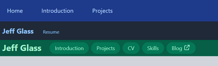
After homing in on the Green menubar as one I liked best, I separated it out into a new HTML file to get to work prototyping some actual content for the page. I created my four major sections (Introduction, Projects, CV, and Skills), each with a header with an ID and a <p> tag for the text. I fleshed out each section with a little Lorem Ipsum text, and arbitrarily decided that I wanted to start with the projects section.
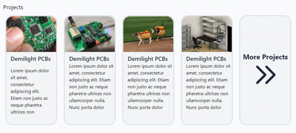
I spent quite a bit of time mucking around with the Flexbox layout before deciding to simplify things by moving to a Grid layout. I've got 4 "cards," each with an image, title, and blurb, that grow slightly when moused-over, and a fifth card that will link to a larger projects page. I do think I'll need to go back to something like Flexbox to make the site more responsive on smaller screens, but I'll cross that bridge down the road. Ideally, these cards would be auto-populated using something like Hugo, but I think fleshing this entry-page out first would be better.
I also ran into an issue with the anchor links in the navbar. Because the navbar is held in a fixed position, using an anchor link to, say the h1 tag with id 'projects', clicking the #projects link sends that header to the top of the page... which is behind the navbar! Thankfully, this stack overflow post has a clever solution that uses CSS's :before selector to position the anchor links lower on the page by a set offset. I made a new tailwind component for this css, applied to to all my page headers, and voila, problem solved.
Of course, none of those cards actually link anywhere yet. But by using a full-size <span> element that fills the entire card at a higher z-value, each box is clickable as a link. This is not a particularly accessible solution, something I'll have to address at some point.
Next, I roughed in the skills section, using some basic indenting and some categories that I'll probably change later. One VSCode plugin that I found very useful at this point is the Lorem Ipsum plugin by Daniel Imms. Particularly because it generates different text at each multi-cursor position, it was simple to add a bunch of placeholder text for each of my skills subsections at this point.
At some point in this mucking around, I got interested in how one strips away some of that giant 180K-line mess of CSS to use just what's actually on the site. Following tailwind's own Optimizing for Production post, I first ran npx tailwindcss init to create a tailwind.config.js file. Then, within that file, I added the path './src/**/*.html' to my purge list. From my upstanding, this means that any class referenced in any html file in the public folder will be preserved, and all the others will be purged when building for production.
It seems there are many ways to manipulate the NODE_ENV variable to switch between production and non-production stages, but one can't do it within the scripts in package.json, since the environment variable needs to be set before npm runs. So, to build the css for production, i'll now run $env:NODE_ENV="production"; npm run build:css on windows, or . Setting the environment variable back to something else (like "dev") and re-running the build command restores our burgeoning 180K lines of css.
Once I'm a little happier with the design (which I'm just playing around with using VC Code's Live Server extension) I'll need to adjust my CD pipeline on GitHub so that, when I push a new HTML file, tailwinds auotmatically rebuilds the css file for production and pushes it to S3. But one thing at a time.
(It's unclear to me whether the above is actually best practices - probably not with a public repository, though I could see myself using a private repo to store the contents of a static site in future.)